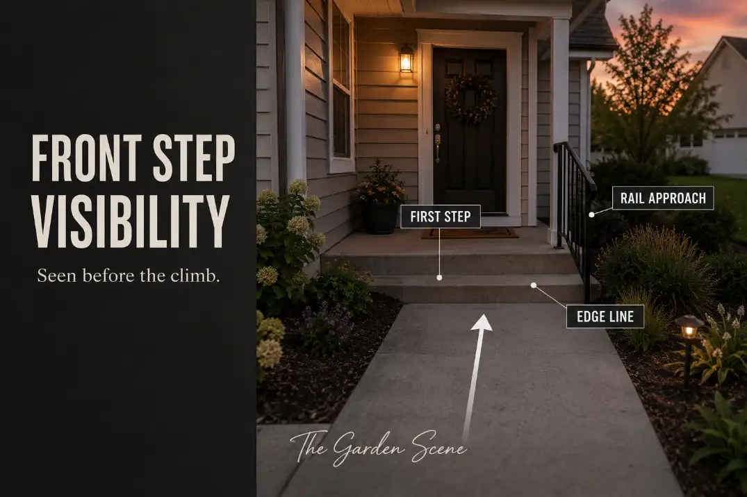
Front step and handrail visibility is mostly about how fast the entry explains itself. A safer front entry lets someone understand three things before the first foot rises: where the step edge begins, where the handrail can be reached, and where the body should move next.
If a visitor has to pause, look down twice, or search for the rail after already stepping up, the entry is not reading clearly enough.
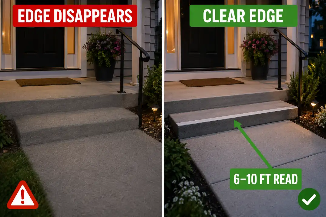
Start with the first 6–10 feet of approach. Can the first step be seen from the walkway? Is the handrail open and reachable for at least 30–36 inches before the climb?
Does the same entry still make sense 30 minutes after sunset or after rain darkens the surface? This is not the same as a traction problem.
A slippery step fails under the foot; a visibility problem fails before the foot lands.
Steps Should Read Quickly
The first step needs the strongest cue
The first riser usually deserves the clearest visual cue because it begins the change in level. A matching concrete step, gray paver landing, or stone porch can look calm in daylight but flatten into one plane from the visitor’s normal approach angle.
When that happens, the person does not see a stair sequence. They see a flat entry that suddenly changes height.
A visible step edge does not need to look loud. A clean 1–2 inch contrast strip, a slightly different nosing material, or a crisp edge line across the full walking width can be enough. The important part is placement.
The cue has to mark the actual leading edge, not a decorative line a few inches behind it.
For a broader treatment of step visibility beyond the front entry, Outdoor Step Visibility Ideas is useful because it separates true edge contrast from general outdoor styling.
The top landing can create the same problem
People often focus on the bottom step and miss the top transition. The top tread and porch landing can blend together, especially when a doormat, seasonal rug, or dark shadow sits near the door.
That creates a different kind of uncertainty: the person knows they are on the stairs, but they cannot clearly read where the stair sequence ends.
The practical test is simple. Stand where a guest naturally approaches, then look at the entry without moving closer.
If the first step and the top landing do not separate within two seconds, the entry needs a clearer hierarchy. Add contrast to the true edge first.
Change mats, pots, and decorative pieces only after the actual level change is easy to read.
Railings Need Clear Approach
A rail should help before the body commits
A handrail is not only a safety object. It is also a visual promise: support starts here. If the rail begins too late, disappears into a dark background, or is crowded by a planter at the bottom step, it becomes a recovery aid instead of a confidence cue.
The rail should be visible and reachable before the first step, not halfway into the climb. That means keeping the approach side open, avoiding objects within the first 30–36 inches of the rail path, and choosing a rail finish that separates from the wall, brick, siding, or porch shadow behind it.
A black rail against pale siding can read beautifully. The same black rail against dark brick may vanish at dusk.
This is where landing space and visibility overlap. If the door swing, mat, packages, and rail approach all compete in the same small area, the rail may technically exist but still feel awkward to use.
The clearance logic in Front Door Landing Clearance applies here because a person needs enough room to pause, turn, and grip without stepping into a crowded zone.
Visibility does not fix a weak rail
A visible rail still fails if it is loose, too short, or positioned where the user cannot naturally grip it. Paint and lighting can make the rail easier to find, but they cannot solve a rail that shifts under hand pressure.
If the rail moves when pulled, if it stops before the first or last step, or if the user has to lean away from the walking line to reach it, the problem is no longer just visibility.
Pro Tip: Stand at the bottom of the entry with one hand carrying a bag. If the rail is not the easiest thing to reach with the other hand, the approach needs to be simplified.
Contrast Helps More Than Decoration
The strongest visual cue should mark the real hazard
Decoration often creates the illusion of a safer entry without improving the part that matters. A striped mat, patterned tile, bright planter, lantern pair, or seasonal sign can make the porch look more finished while the true step edge still blends into the landing.
The eye follows the strongest cue first. If the strongest cue is decor instead of the level change, the entry is visually busy but not safer.
Contrast should be assigned a job. The step-edge cue marks the rise or drop. The rail cue marks the support line. The lighting cue reveals the walking surface. Everything else should stay quieter.
For entries that also need grip improvement, Best Non-Slip Step Treads for Outdoor Entries is more useful than adding another decorative surface because it connects traction with the actual landing area of the foot.
Which visibility fix solves which problem?
| Problem Seen at Entry | Stronger Fix | Why It Works | Weak Fix to Avoid |
|---|---|---|---|
| Step blends into landing | Contrasting front edge | Marks the true level change | Patterned mat behind the edge |
| Rail disappears at dusk | Rail color contrast | Makes the support line readable | More porch decor near the rail |
| Entry looks bright but step is shadowed | Low, directed step light | Reveals the tread edge | Brighter bulb aimed at eyes |
| Plants lean over the edge | Trim or relocate planting | Clears the walking and reach zone | Seasonal trimming only |
| Top landing feels uncertain | Plain mat behind edge line | Keeps the final step readable | Busy rug crossing the transition |
A plain edge line across the walking width does more for movement than several attractive objects around the porch. The best order is edge contrast first, rail approach second, plant clearance third, and low-glare lighting fourth.
Plants Can Hide the Edge
Mature spread matters more than nursery size
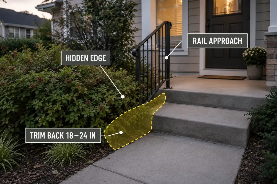
Plants hide front steps slowly, which is why they often get blamed too late. A small ornamental grass, low shrub, or soft perennial may look harmless the first season.
After spring growth, rain, or one missed trim cycle, it can lean 6–12 inches over the edge and blur the first step from the approach.
The useful rule is to design around the mature plant shape, not the size on planting day. Near steps and railings, many small shrubs and grasses need an 18–24 inch setback from the step edge or rail approach.
If a plant needs constant cutting to stay out of the walking line, it is probably planted too close.
This matters even more for people arriving with limited attention. A homeowner may remember the exact step location, but a guest, delivery driver, or older relative reads the entry fresh.
Front Walkway Safety for Visitors and Deliveries fits the same problem because the route has to work for people carrying boxes, bags, or food.
Plants can create false edges
A plant edge should frame the route, not pretend to be the step. When a dark mulch line, grass clump, or planter rim sits 12–24 inches before the real riser, it can create a false boundary. That is worse than plain emptiness because it gives the eye the wrong information.
If you want softness near the entry, keep planting beside the route and away from the exact line where the foot has to read a height change. The plant should guide the body toward the step, not compete with the step.
Night Visibility Changes Everything
Brighter light can still miss the step
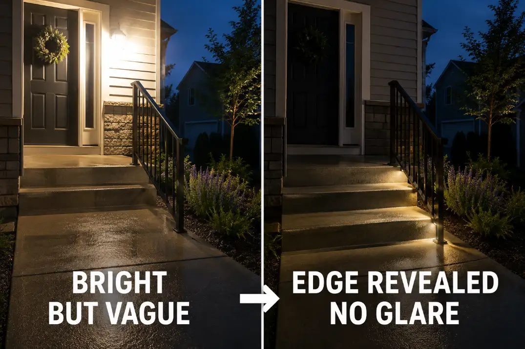
The obvious fix is to add a brighter bulb. That helps only when the light reaches the right place. A porch light behind the person may brighten the door and siding while leaving the lower tread in shadow.
A floodlight may make the whole entry feel bright but flatten the step edge. In both cases, the entry has light, but the step still does not read.
Better night visibility usually comes from controlled light that reveals the walking surface and the level change together. Warm white light around 2700K–3000K often feels residential while still giving enough visual information when aimed well.
The goal is not to make the porch look brighter from the street. The goal is to make the first step, rail start, and landing visible from the approach.
For entries where steps, slopes, and walkways connect, Path Lighting for Steps, Slopes, and Walkways gives a stronger framework than simply increasing porch brightness.
Wet evenings are the real test
A dry step in daylight is the easiest version of the entry. The harder test is a wet evening, especially when concrete, stone, or pavers darken after rain.
A step edge that looked obvious at 2 p.m. may become vague after rain at 7 p.m. That is a visibility problem, not a decorating problem.
Check the entry from three places: the public sidewalk or driveway, the bottom of the front walk, and the point where someone first reaches for the rail.
If the rail is visible from one position but disappears from another, fix the approach view rather than assuming the entry is solved.
Safer Without Looking Institutional
Use residential cues in the right order
A safer front entry does not need to look like a clinic entrance. The mistake is thinking the only choices are invisible design or heavy institutional hardware. A home entry can feel polished and still be much easier to read.
Start with the safety hierarchy: edge contrast first, rail approach second, plant clearance third, and low-glare lighting fourth. That order matters because styling changes cannot compensate for a hidden edge or unreachable rail.
A black rail can work against pale siding. A bronze rail may work against light stone. A lighter rail may be better against deep red brick or a shaded porch.
The correct color is not the trend color. It is the color the eye finds fastest from the normal walking line.
Good ideas that still feel like a home
Use a clean contrast nosing instead of a warning-stripe look. Paint or refinish the rail so it separates from the background without becoming the loudest object on the porch. Keep the doormat plain and behind the step edge, not crossing it.
Place planters along the side of the approach, not at the first reach toward the handrail. Use low side lighting to reveal the tread instead of blasting the whole entry with glare.
These fixes work because they make the entry legible. The front step still looks residential, but the movement line becomes easier to understand.
Questions People Usually Ask
Should the handrail be darker or lighter than the porch?
Choose the rail color by background contrast, not by style alone. A dark rail usually reads well against pale siding, white trim, or light stone.
A lighter or warmer rail may read better against dark brick, deep shade, or black porch posts. Test it from the walkway at dusk before deciding.
Is a non-slip tread better than a contrast strip?
They solve different problems. A non-slip tread helps grip after the foot lands. A contrast strip helps the person see where to place the foot before stepping.
On many front entries, the strongest fix combines both: a tread or nosing that improves traction and clearly marks the leading edge.
When are small visibility fixes not enough?
Small fixes stop making sense when the entry geometry or hardware is wrong. If riser heights vary noticeably, the landing is too tight, the rail moves under pressure, or the rail starts after the first step, visibility upgrades should not be treated as the whole solution.
At that point, the entry needs a layout or hardware correction, not just better styling.
For broader accessibility guidance on stair dimensions, handrails, and visible tread edges, see the U.S. Access Board’s ADA stairways guide.