Garden inspiration usually fails for one practical reason: the idea was copied as a look, not tested as a working outdoor space.
The first checks should be simple: can people walk through without turning sideways, can chairs pull out at least 24 to 30 inches, and will the plants or decor still fit after one full growing season?
If a path narrows below about 30 inches, the yard may still photograph well, but daily use starts to feel annoying.
This is different from a yard that only needs better styling. A poorly styled space can often be improved with fewer colors, cleaner furniture, or better planting rhythm.
A hard-to-use space has a deeper problem: the layout, scale, maintenance load, or comfort conditions are wrong. Swapping cushions or adding another planter rarely fixes that.
What People Usually Misread First
A good photo is not a working plan
The biggest mistake is assuming a beautiful reference photo proves the layout will work. It only proves the photo worked from one angle, under one light condition, with furniture and plants arranged for that frame.
A real yard has routes, doors, slope, shade, hose access, pets, trash bins, mower movement, neighbor views, and weather exposure. Those constraints matter more than the mood of the image.
A garden idea that ignores the route from the back door to the gate can become frustrating within the first week, even if it looks polished on day one.
This is why inspiration should be filtered through site fit before buying materials. A layout that feels calm in a wide photo can feel tight in an 8-by-10-foot patio corner, especially when the chair legs, planter depth, and door swing all compete for the same space.
If the main issue is copying images without checking yard fit, the deeper breakdown is covered in Garden Inspiration Photos Don’t Fit Every Yard.
The symptom is clutter, but the mechanism is conflict
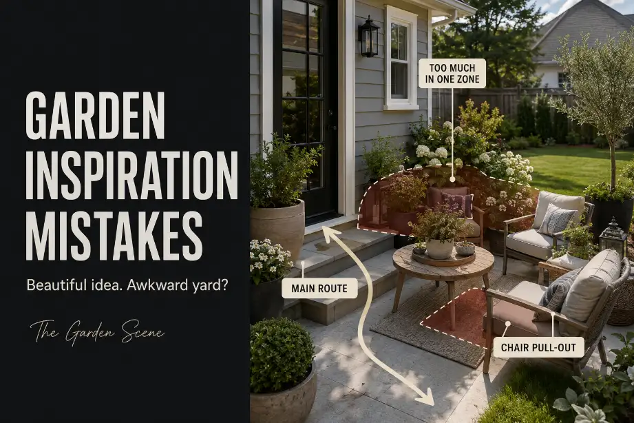
People often call these spaces “cluttered,” but clutter is usually only the symptom. The real mechanism is conflict: the same square footage is being asked to support walking, sitting, planting, storage, shade, and decoration at once.
A small bench, two planters, a side table, a lantern, and a rug can all be reasonable choices separately. Together, they may steal the only clear route through the yard.
The fix is not always to “declutter.” The sharper fix is to decide which use owns the space.
Prioritizing Appearance Over Function
Start with movement, not objects
The strongest outdoor spaces usually begin with movement. Where do people enter? Where do they pause? Where does the chair need to slide back? Where does a guest naturally walk when carrying food, a drink, or a tray?
A practical route should usually stay around 36 inches wide when it is used often. A tighter 30-inch passage may work as a short secondary pinch point, but it should not become the main path between the house and the yard.
Once the route drops below that, people start stepping into planting beds, dragging chairs sideways, or avoiding the space.
Buying a prettier chair, a larger planter, or a more dramatic fire bowl does not fix a circulation problem. It only upgrades the object causing the conflict.
Test the first-use problem before the final look
Use flags, rope, cardboard, or painter’s tape to outline the bed edge, chair zone, grill zone, or planter footprint. Then walk the route for 2 or 3 normal days.
If the markers are already annoying before anything permanent is installed, the finished version will not improve. It will usually feel worse because plants grow, furniture shifts, and outdoor objects rarely stay as tightly arranged as they do in a photo.
When the issue is broader yard usability rather than one copied image, Backyard Layout Problems That Make Spaces Hard to Use gives a more direct way to read the space before adding more features.
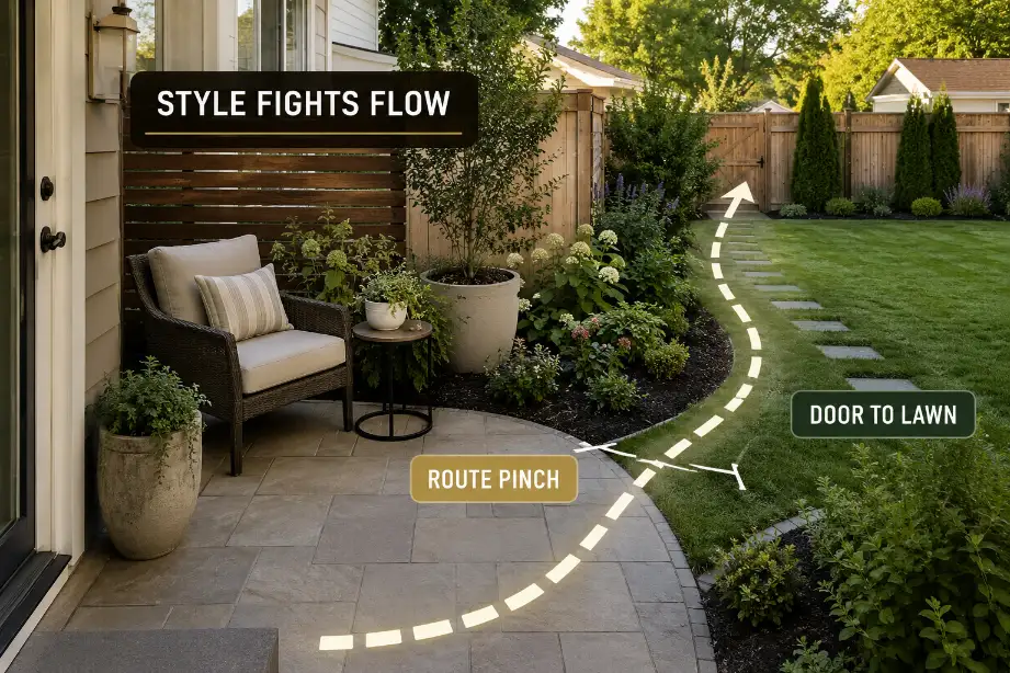
Blocking Natural Walking Routes
The most important route is often invisible in the photo
Inspiration images usually hide the route. They show the seating corner, the planting bed, the view, or the decorative moment. They rarely show the path from the door to the hose, the side gate, the trash area, or the grill.
That hidden route is often the first thing damaged by a copied layout. A curved planting bed may look soft and natural, but if it pushes into the direct line between the patio and gate, people will cut across mulch within a few days.
A planter wall may frame a seating area nicely, but if it blocks the fastest path to the yard, it becomes an obstacle rather than a feature.
Do not solve route problems with stepping stones alone
Stepping stones are a common weak fix. They can help define a route, but they do not make a cramped layout work. If the actual walking line is blocked by furniture, oversized pots, or mature shrubs, stones simply document the problem.
A better fix is to protect the route first, then shape the decorative elements around it. Keep the path clear, reduce bed depth, shift seating out of the crossing line, or choose narrower vertical planting instead of wide spreading shrubs.
| Inspiration choice | What looks good first | What fails in real use | Better first check |
|---|---|---|---|
| Deep curved bed | Soft, designed edge | Narrows the daily route | Keep 30–36 inches clear |
| Oversized lounge chair | Relaxed, upscale feel | Blocks pull-out space | Test 24–30 inches behind it |
| Clustered planters | Full, styled corner | Creates watering and access clutter | Limit depth before adding height |
| Outdoor rug | Makes the zone feel finished | Defines a zone too large for the patio | Match rug size to chair movement |
| Dense planting | Looks mature immediately | Crowds paths by year 2 or 3 | Check mature width, not pot size |
Adding Too Many Competing Features
One outdoor zone cannot do every job
A small outdoor space becomes difficult when every inspiration idea gets a place: dining, lounging, fire, privacy, water feature, planters, lighting, storage, and decor. Each feature may be attractive, but the yard starts to lose hierarchy.
Most usable spaces have one primary job and one supporting job. A patio might be for dining first and planting second. A side yard might be for access first and storage second. A front corner might be for privacy first and curb appeal second.
Once three or four features compete in the same small zone, the space often stops feeling intentional. It becomes a showroom of ideas instead of a yard that supports daily life.
Edit by friction, not by style
The best feature to remove is not always the ugliest one. It is the one creating the most friction. That may be the large pot that blocks the hose, the extra chair nobody uses, the decorative table that steals knee room, or the low lantern that makes a narrow path feel smaller at night.
A common overestimate is how often a dramatic feature will be used. A fire pit, fountain, or outdoor bar may feel like the “main idea” in planning, but if it only gets used a few times per month and blocks the daily route every day, it does not deserve the best square footage.
This same mistake shows up with decor-heavy yards. A space can look styled online but feel awkward outside when object scale, walking space, and sightlines do not agree, which is why Garden Decor That Looks Good Online but Feels Wrong Outside is a useful companion read.
Ignoring Long-Term Maintenance Burden
Low-maintenance is often lost during the buying phase
Many garden inspiration mistakes do not fail immediately. They fail after growth, weather, and upkeep expose the hidden cost of the idea.
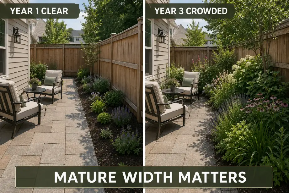
A border that looks full in spring may need weekly trimming by mid-summer. A gravel-and-planter corner may look clean at installation but collect leaves, weeds, and blown mulch after several storms. A dense shrub grouping may stay manageable for the first year, then push into the walkway by year 3.
Maintenance should be judged before installation, not after regret. Ask how often the area will need watering, pruning, sweeping, deadheading, seasonal storage, or cleaning. If one small feature adds 30 to 45 minutes of upkeep every week during the growing season, it should earn that time through real use, not just appearance.
Mature size matters more than nursery size
The most underestimated condition is plant growth. A 1-gallon shrub or young ornamental grass can look harmless near a path. At mature width, that same plant may reach 3 to 5 feet across and cut a walkway in half.
This is where routine fixes stop making sense. Trimming a plant once or twice a season is normal. Trimming every 10 to 14 days just to keep a chair usable or a walkway open usually means the plant is wrong for the location. At that point, pruning is not maintenance; it is compensation for a bad placement decision.
Choosing Decor Without Considering Scale
Decor should support the room, not shrink it
Garden decor often fails because the object is judged alone. A large urn, sculpture, bench, lantern, or mirror may be attractive in a store or photo. Outside, it has to share space with walking, seating, planting, and weather movement.
Scale is not just height. It is footprint, visual weight, clearance, and how much attention the object demands. A tall narrow planter may work better than a low wide bowl because it adds vertical interest without stealing path width.
A small side table may be more useful than a decorative bench if the bench blocks movement and never gets used.
In tight patio zones, table shape also affects movement more than people expect. A round table can soften a turn, while a sharp rectangular table may protect serving space but narrow the pass-through.
If furniture scale is part of the mistake, Best Patio Table Shapes for Small Spaces can help connect the layout problem to a better buying decision.
The wrong fix is adding balance pieces
When one large decor object feels awkward, many people add a second object to “balance” it. That often makes the space worse.
Two large planters can frame an entrance beautifully, but they can also narrow a landing, block a hose route, or make a patio corner feel staged rather than livable.
The better fix is to reduce the number of objects and make one of them work harder. Choose one planter with height, one bench with storage, one light source that supports safety, or one table that actually serves the seating area. In tight yards, usefulness should beat symmetry.
Creating Spaces That Look Good but Feel Uncomfortable
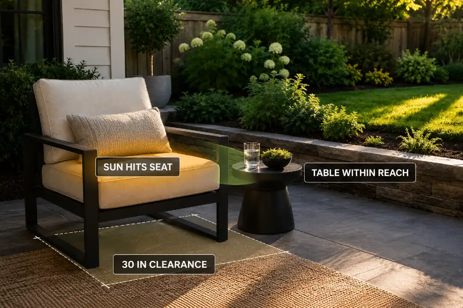
Comfort problems are usually physical, not decorative
A space can look finished and still feel wrong because the comfort layer was never tested. The chair may be too low for older adults, the table may sit too far away, the afternoon sun may hit the seat for 3 hours, or the view may face a blank wall instead of the yard.
These are not styling problems. They are body, heat, distance, and exposure problems. A seat that looks inviting but faces full western sun in Arizona or inland California may be unusable during the hottest part of the day. A shaded corner in a humid Florida yard may feel still and buggy if airflow is blocked by dense planting.
Comfort should be tested at the time the space will actually be used. A coffee corner needs morning light and easy door access.
A dinner patio needs evening shade, chair clearance, and a route from the kitchen. A reading nook needs back support, quiet, and enough side-table space for real use.
A quick diagnostic before copying the idea
Before using a garden inspiration photo as a plan, check the idea against these signals:
- The main route stays close to 36 inches wide, with only short pinch points near 30 inches.
- Chairs can move back 24 to 30 inches without hitting beds, pots, walls, or steps.
- The main feature supports daily use, not just occasional display.
- Plants are placed by mature width, not nursery size.
- Maintenance does not add weekly work the space does not justify.
- Shade, wind, glare, or humidity are checked at the real use time.
- Decor improves the zone without becoming the zone.
If three or more of those checks fail, the inspiration idea probably needs to be shrunk, simplified, or rebuilt around the yard’s actual constraints.
How to Use Inspiration Without Making the Yard Harder
Copy the relationship, not the whole scene
The most useful part of an inspiration photo is usually the relationship between elements: a chair near shade, a path beside planting, a vertical screen behind seating, a low table within reach, or a soft edge along a hard surface.
Copying the whole scene is where trouble starts. Your yard may have a different door position, different sun angle, smaller patio, stronger wind, heavier rainfall, or less storage.
In Midwest yards with seasonal rain, a low decorative corner can become a debris trap. In northern states, freeze-thaw movement can make tight hardscape edges and heavy planters harder to manage over time.
A stronger approach is to translate the idea. Keep the useful relationship, then adjust the size, plant choice, furniture depth, and route around your actual space.
That is also the more practical way to use Garden Inspiration That Works in Real Yards without creating another display-only corner.
When small edits stop working
The standard fix is editing: remove one chair, use smaller planters, reduce the bed depth, or simplify the feature list. That works when the basic layout is sound.
It stops working when the main route, comfort zone, or maintenance burden is fundamentally wrong. If the only clear walkway crosses the seating area, if every plant needs constant trimming to stay out of the path, or if the main seat is uncomfortable at the exact time you want to use it, small styling changes will not solve the problem.
At that point, the layout needs to be reset around function first. Keep the inspiration mood if it still fits, but rebuild the plan around movement, clearance, mature growth, and comfort.
A yard does not have to look less beautiful to work better. It usually has to become more selective.
For broader official guidance on matching landscape plants to site conditions, see the University of Minnesota Extension landscape design and plant selection guide.