Garden inspiration photos usually fail when they are treated as finished plans instead of edited examples. The first checks should not be color, furniture style, or plant names.
Check usable width after growth, daily sun exposure in hours, and fixed limits such as fences, doors, slopes, utilities, drainage, and property lines.
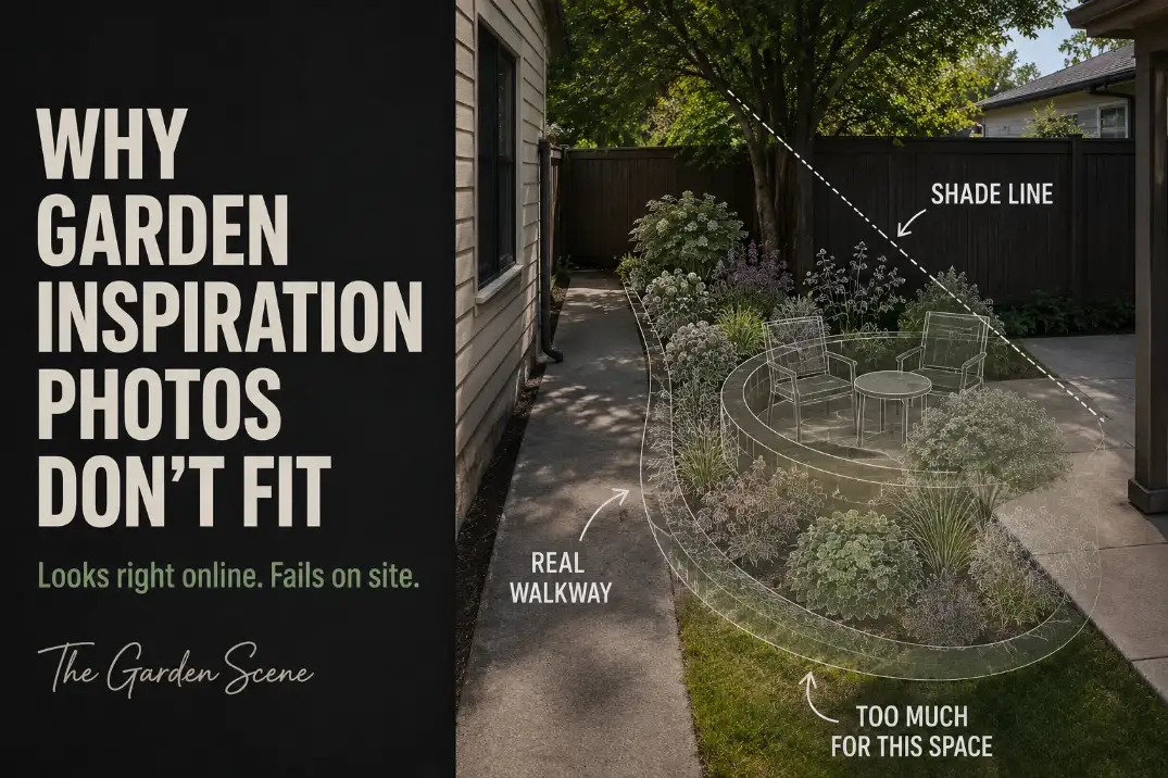
If an idea needs a 36-inch walking route but your yard only leaves 28 to 30 inches after planters, the photo is not “almost right.” It is already too large.
This is different from a style mismatch. A style mismatch means the colors, materials, or mood feel wrong. A site mismatch means the idea cannot fit, drain, age, grow, or stay usable in your real yard.
The photo may look simple because the maintenance, maturity, climate, and access problems are outside the frame.
The Camera Hides Scale Problems
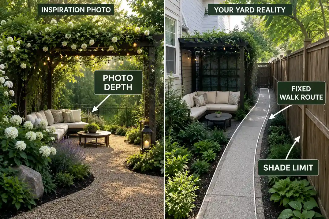
A garden photo can make a limited yard look generous because the camera chooses the best angle, not the everyday route. Wide lenses stretch depth. Low angles hide how close planting is to a path. Tight cropping removes the grill, hose reel, AC unit, gate swing, trash route, or side-yard access that would change the whole layout.
Photo depth is not usable depth
The most common mistake is copying the visible scene without measuring the empty space around it. A seating corner in a photo may look relaxed because no one is showing the 24 to 30 inches needed to pull a chair back, the 36 inches needed for a comfortable walking route, or the 18 to 24 inches often needed behind planting for fence repair, pruning, or drainage checks.
That matters more than the focal point. A beautiful bench, arbor, gravel path, or layered border can still make the yard worse if it steals the route people use every day. This is the same reason some pieces in Garden Decor That Looks Good Online but Feels Wrong Outside disappoint once they leave the photo and enter a working yard.
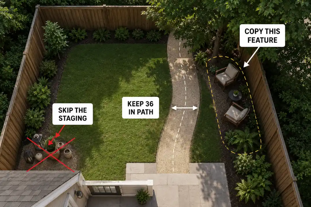
Measure the empty space first
Before judging the style of an inspiration photo, mark the usable route in your yard. Do not start with the prettiest object. Start with the space that must stay empty.
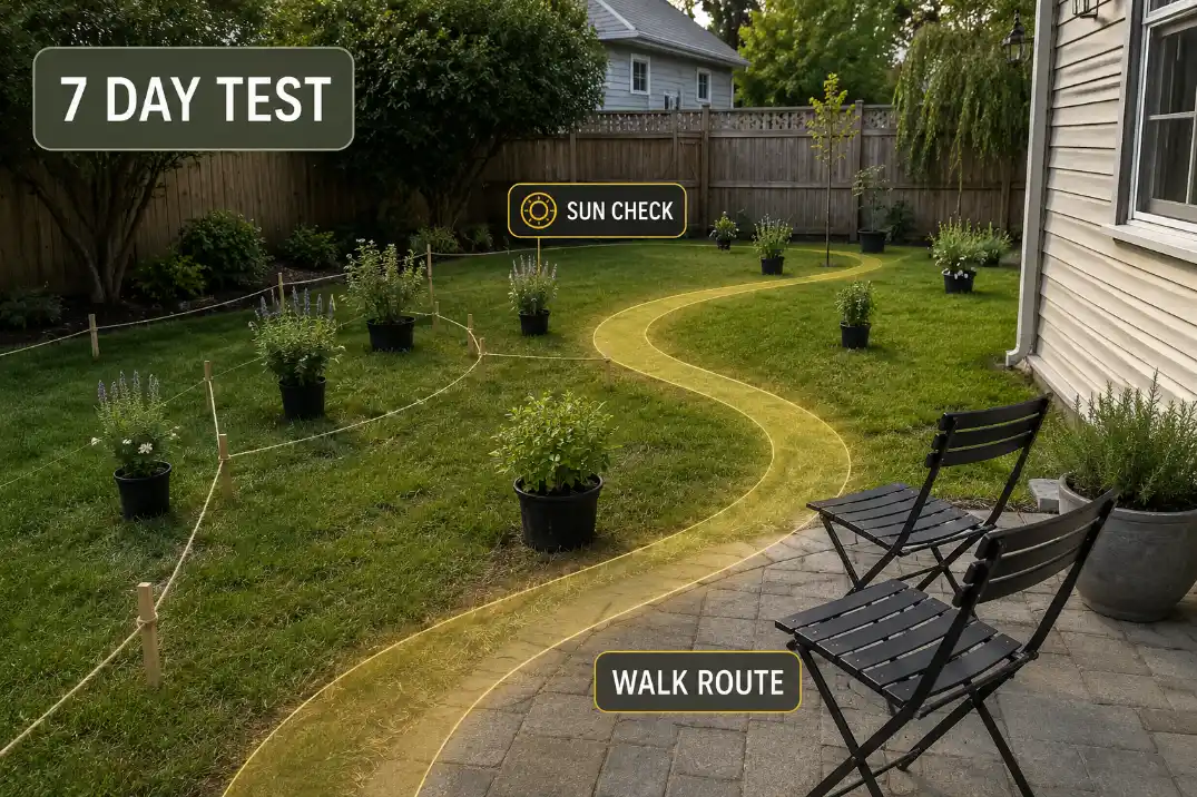
A simple test works better than guessing. Use rope, nursery pots, cardboard, or painter’s tape to outline the idea at full size for 48 hours. Open the back door. Pull out the chairs. Walk the hose through the space. Carry a trash bag, serving tray, or laundry basket if that route is part of daily use.
If the test layout gets stepped over, avoided, or bumped twice in two days, the design is already asking too much from the yard.
Mature Landscapes Look Different Than New Installations
Many garden photos show either brand-new installations or fully mature landscapes. Both can mislead. New installations hide future crowding. Mature landscapes hide the years of pruning, thinning, replacement, and irrigation that got them there.
Young plants create false spacing
A 1-gallon shrub can look harmless in a photo, but a plant with a 4-foot mature spread does not care that the bed is only 30 inches deep. The failure may not appear in the first season. It often shows up in year two or year three, when paths narrow, seating edges feel brushed by foliage, and plants begin leaning for light.
That is why plant spacing should be judged by mature width, not container size. If a tag says 3 to 5 feet wide, sketch it as 5 feet unless you are willing to prune it several times a season. The prettier a mature planting photo looks, the more likely it has already been edited by time, upkeep, and selective camera framing.
The first failure is usually movement
People often notice crowding as a plant problem, but the first useful symptom is movement. You brush against foliage. Guests avoid a chair.
A walkway feels damp after rain because leaves overhang the path. The plant may be healthy; the layout is what failed.
This is where copying a dense border from a photo can backfire in small yards. If plants are already close to walkways or seating, the better comparison is not another inspiration image but a spacing problem like Backyard Plants Crowding Paths and Seating.
That kind of failure pattern shows what the photo usually hides: growth changes the route before it ruins the look.
Climate Differences Change the Outcome
A photo taken in a cool coastal garden does not promise the same result in Arizona heat, a humid Florida yard, a windy Midwest corner lot, or a northern freeze-thaw climate.
Climate changes more than plant survival. It changes comfort, material aging, water demand, mildew pressure, and the rhythm of seasonal attention.
Sun hours matter more than the plant palette
A “sunny” photo may not match your sun exposure. Full sun generally means about 6 or more hours of direct sun. Part sun often sits closer to 4 to 6 hours. A narrow side yard with 2 or 3 hours of morning light is not a softer version of the same condition; it is a different planting site.
Readers often overestimate how much shade plants can tolerate if the photo still looks bright. The camera can make reflected light look like real growing light.
It can also hide the afternoon heat that bakes light-colored pavers and raises surface temperatures around shallow roots.
Rebuying the same plant is often the wrong fix
One fix that wastes money is buying the same plant again after it struggles. If the real cause is heat, water restriction, compacted soil, salt exposure, winter burn, or poor drainage, replacement only repeats the mismatch.
In dry regions, a lush inspiration bed may need irrigation that does not make sense for the yard. In humid regions, dense planting may hold moisture against walls, fences, or seating edges for 24 to 48 hours after rain.
In northern states, freeze-thaw movement can make lightly based stone paths shift even when the same path looked clean in the original photo.
For climate-driven plant decisions, Choose Front Yard Plants for Water Restrictions is often more useful than copying the color palette from a saved image.
Property Lines Create Design Limits
Photos rarely show the legal and practical limits that shape a real yard. The best-looking part of an image may sit where your yard has a setback, easement, drainage path, neighbor-facing window, shared fence, utility box, or gate swing.
The invisible boundary controls the visible design
A privacy hedge may look perfect in a photo because the camera ignores the property line behind it. In a real yard, that same hedge may need to stay inside your boundary, away from a sidewalk, clear of a utility box, and below an HOA height limit.
A 6-foot screen is not automatically better than a 4-foot layered planting if the taller version blocks visibility, access, or neighborhood rules.
This is one condition readers commonly underestimate. They see the finished look and assume the yard only needs the right plants. In reality, the boundary often decides planting depth, height, access, and screen placement before style enters the conversation.
Shared edges need breathing room
Fence-line gardens are especially easy to copy badly. A photo may show lush planting tight against a fence, but your yard may need 18 to 24 inches of access for pruning, drainage checks, fence repair, or trash-bin movement. Once the bed fills in, that missing access becomes a recurring problem.
The same logic applies to neighbor-facing yards. A dense design can look private in a photo but still feel awkward if it pushes seating directly against the shared edge. ,
For layouts shaped by fence lines and neighbor pressure, Backyard Layout Mistakes in Shared Fence Yards gives a more realistic planning frame than a staged inspiration shot.
Hidden Maintenance Requirements Most Photos Ignore
The cleanest garden photos often hide the highest upkeep. Sharp gravel edges, spotless stepping stones, clipped hedges, white cushions, tight groundcovers, and deep planting beds look effortless because the photo was taken at the best moment.
Clean edges are a maintenance promise
A crisp gravel path is not just a material choice. It is a promise to rake, edge, weed, and keep loose stone from spreading. A formal hedge is not just a privacy idea. It is a pruning schedule. A dense flower border is not just color. It is deadheading, spacing, irrigation adjustment, pest monitoring, and seasonal cleanup.
A genuinely manageable low-maintenance yard might need light attention every 1 to 2 weeks during the growing season. A failing “low-maintenance” copy may need correction every few days because the wrong plant is shedding, flopping, drying out, spreading, or blocking the path.
Monthly upkeep cannot support a weekly design
The condition people overestimate is the power of the initial installation. They assume that once the plants, edging, and furniture are in place, the scene will hold.
The condition they underestimate is routine friction: how often leaves fall into gravel, how quickly vines reach a gate latch, how long cushions stay damp, or how many times a week a route must stay clear.
That is why a garden can be beautiful and still be wrong for the household. If the photo depends on weekly clipping but the yard only gets monthly attention, the design is not low maintenance.
It is delayed maintenance. This is the same failure pattern behind many designs in Why Low-Maintenance Gardens Never Stay That Way.
| Photo cue | What it may be hiding | Safer adaptation |
|---|---|---|
| Dense planting beside a path | Mature spread reducing usable width | Use fewer plants and protect 36 inches of clear route |
| Bright flowering border | Different sun exposure or irrigation demand | Match plants to measured sun hours, not color |
| Clean gravel edge | Weed pressure, slope, runoff, or foot traffic | Add firm edging or choose a more stable surface |
| Private seating corner | Fence access, neighbor windows, or gate swing | Shift seating before adding screening |
| Mature layered garden | Years of pruning and replacement | Copy the layering idea, not the plant count |
Adapt Inspiration Instead of Copying It
The strongest way to use a garden photo is to extract the move, not duplicate the scene. A move might be “shade the seating edge,” “frame the walkway,” “soften the fence,” “pull plants away from the door,” or “use one vertical feature instead of many small objects.”
The 5-part photo translation test
Before buying plants, furniture, stone, edging, or screening, translate the image through your actual yard:
- Identify the job the photo performs. Is it creating shade, privacy, softness, direction, storage, or a sitting zone?
- Remove the staged objects. Ignore pillows, fresh mulch, perfect lighting, and camera angle.
- Draw the fixed limits. Mark property lines, doors, gates, utilities, slopes, drainage paths, and walking routes.
- Sketch mature sizes. Use full plant width, not nursery-pot size.
- Copy only the surviving move. If the idea still fits after those checks, adapt it. If not, shrink or replace the method.
This is where an inspiration photo becomes useful. You are no longer asking your yard to imitate a picture. You are asking which part of the picture solves a real problem.
Buy for the adapted version, not the photo version
If the inspiration photo depends on lush planting beside a narrow route, the better buying move is not to shrink every plant equally. Use tighter species, slimmer materials, and fewer vertical layers; that is where Best Plants and Materials for Narrow Side Yards supports the real decision better than another broad inspiration board.
The same rule applies to seating, shade, privacy, and paths. If your yard only has room for one strong feature, do not buy four small objects to mimic the photo. Keep the job and reduce the parts.
Layout Note: A copied garden idea should make the yard easier to use within one week of testing. If the mockup already blocks movement, traps dampness, or needs constant adjustment, the permanent version will not become easier later.
When the Standard Fix Stops Working
The standard fix is usually to buy a smaller version of the same object, choose a similar plant, or move the feature a little to the side. That works only when the issue is minor. It does not work when the photo’s core condition is missing from your yard.
If the path keeps narrowing, do not buy slightly smaller decor and hope the same layout works. If the plant fails after two replacements, stop replacing the plant and change the site match. If a privacy screen blocks a gate, traps damp air, or creates a maintenance strip you cannot reach, reduce the screen instead of adding more height.
A good inspiration photo should survive your real constraints. If it only works after you ignore clearance, sun, access, property lines, and upkeep, it is not a design direction. It is a staged mood.
Key Takeaway
Garden inspiration photos are useful when they help you see a principle. They become expensive when they replace measuring. The better question is not “Can I make my yard look like this?” It is “Which part of this idea survives my space, sun, climate, growth, upkeep, and boundaries?”
Start with the fixed limits, then test the movable pieces. Keep 36 inches of walking clearance where people pass. Measure sun for a full week.
Sketch mature plant sizes, not nursery sizes. Leave access along fences, gates, and utilities. Then copy only the part of the photo that still works after those checks.
For broader official guidance on site analysis before landscape planning, see the University of Florida IFAS Extension landscape design guide.