Last updated: July 3, 2026
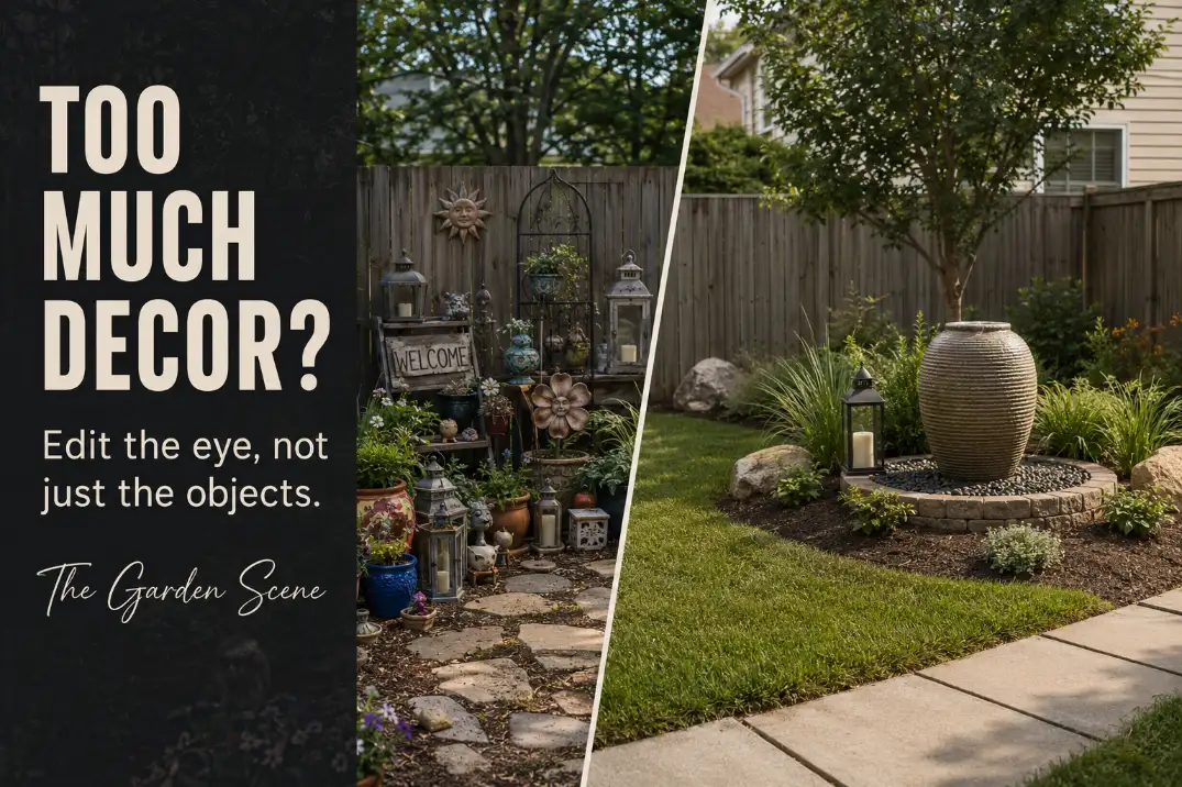
Garden decor usually starts to feel overcrowded before anything is physically wrong with the space.
The walkway may still be open. The patio may still function. The individual pieces may even be attractive. The problem is that too many objects are trying to become the thing you notice first.
A lantern, a bright pot, a metal bird, a patterned cushion, a garden sign, a small statue, and three accent planters can each look harmless on its own. Together, they can make the eye work too hard. The garden stops reading as one calm outdoor space and starts reading as a collection of separate moments.
The weak version of garden decor advice is “add personality.” That is not wrong, but it is incomplete. Personality without hierarchy becomes visual noise. The better question is not “What else can I add?” It is “Which object owns the view, which pieces support it, and which pieces should stay quiet or leave?”
This is a visual editing problem, not a walkway blockage problem. The goal is to reduce repeated small objects, group what belongs together, protect negative space, limit competing materials, and give the garden one clear visual order.
Why Garden Decor Starts Looking Crowded
Garden decor looks crowded when the eye cannot tell what matters most.
That can happen even in a large yard. A wide patio with too many little accents can feel busier than a compact garden with one confident focal piece. The issue is not always square footage. It is visual competition.
Small decor is especially risky because it rarely has enough presence to anchor a view by itself. One small lantern beside a planter can be charming.
Six small lanterns spread across a patio edge, bed corner, step, bench, and fence line begin to read as scatter. The eye keeps stopping, restarting, and looking for a main point.
Repeated accents create the same problem. A few blue ceramic pots can create rhythm. Blue pots, blue pillows, blue stakes, blue signs, and blue glass ornaments can make the entire garden feel themed rather than edited. Repetition works when it supports a larger composition. It fails when every repeated item tries to be noticed.
Material variety can also make the garden feel full before the object count is actually high. Stone, ceramic, metal, painted wood, resin, concrete, glass, and patterned fabric all carry different visual weights. When too many appear in one view, the garden starts to feel assembled from separate purchases instead of shaped as one space.
The quick read
A garden usually looks overcrowded for one of these reasons:
- Too many small objects are spread across the view.
- Several pieces are competing to become the focal point.
- The material palette has no restraint.
- Every corner has been decorated.
- There is no quiet space around the strongest objects.
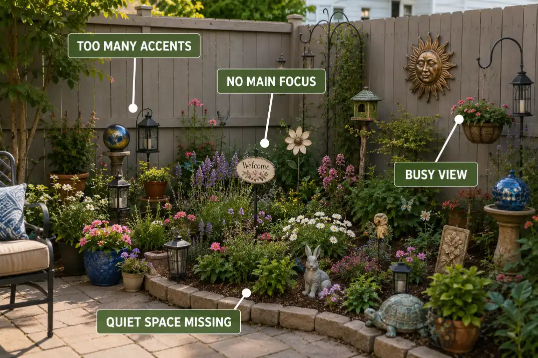
The first edit is not to remove everything. It is to find out which pieces are doing the same job.
Stop Decorating Every Spot Equally
The fastest way to overcrowd a garden is to treat every open spot as unfinished.
A bare fence corner does not always need a hanging sign. A patio table does not always need a centerpiece. A bed edge does not always need a row of ornaments. A quiet wall, simple planter, or undecorated patch of mulch may be doing more for the garden than another accent would.
Good garden decor needs unequal importance. Some areas should carry attention. Some should support. Some should stay quiet. When every surface, corner, and transition gets decorated, the garden loses the pauses that make the decorated areas feel intentional.
This is where many outdoor spaces go wrong. Homeowners often decorate the visible gaps first, then wonder why the yard feels smaller. The gap was not always a problem. Sometimes it was the breathing room between stronger moments.
A seating corner, front entry view, porch step, dining edge, or garden gate can hold a stronger decorative moment. The rest of the space does not need to compete with it.
If the overall outdoor room already has a clear structure, decor can stay selective. That is why how outdoor spaces rely on clarity rather than accumulation matters before adding more accents.
Do not ask, “Where can I put decor?” Ask, “Where should the eye pause?”
That change alone removes half the clutter pressure.
Choose One Focal Role First
Choose the lead object before deciding what to remove.
A focal piece does not have to be expensive, dramatic, or oversized. It could be a large planter, a sculptural pot, a water bowl, a bench against a simple wall, a planted urn near a gate, or a clean wall feature. What matters is that it owns the view clearly enough that smaller decor does not need to shout.
The rest of the decor should fall into supporting roles. A support accent might repeat the focal piece’s color, shape, or material. Background texture might add quiet depth without demanding attention. Anything that creates a second competing story should be questioned.
The hierarchy test
Stand at the main viewing point: the patio door, the seating area, the front walk, or the kitchen window. Ask which object your eye lands on first. Then ask what your eye sees second.
If the second object supports the first, the composition is probably working. If the second object argues with the first, the garden may be visually split.
| Decor role | What it should do | What to avoid |
|---|---|---|
| Focal piece | Own the main view | Competing with another statement object |
| Support accent | Echo the focal piece | Creating a separate mini-theme |
| Background texture | Add quiet depth | Asking for attention |
| Remove | Reduce visual noise | Keeping it because it was already there |
This is especially important in compact yards, where a few small choices can change the entire view.
If the space already feels visually tight, small-space visual balance matters more than adding another decorative layer.
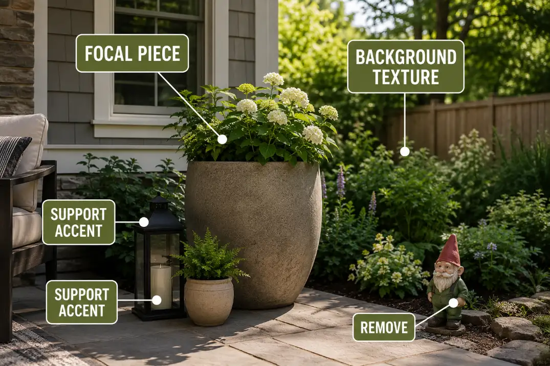
A strong focal role makes editing easier because every other object has to justify itself.
Group Small Decor Instead of Spreading It Around
Small decor should either join a composition or leave the view.
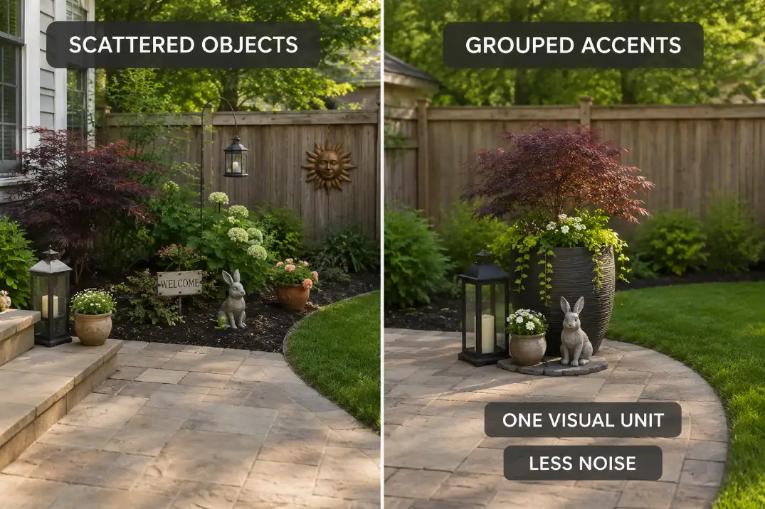
A single small pot at each step, one lantern by the chair, one ornament in the bed, one sign on the fence, and one garden stake near the path can feel like five separate interruptions. None is large enough to anchor the space. Together, they make the garden feel busy.
Grouping changes the reading. Three small pots in related materials can become one composition. A lantern, low bowl, and planter can feel intentional when they share a surface, color family, or height relationship. The goal is not to make a display shelf outside. The goal is to make several small pieces read as one visual unit.
Grouping works best when the pieces have a reason to belong together. Use one shared cue: similar material, similar color, related shape, or a clear height progression. Do not group unrelated objects just to avoid removing them. A cluster of mismatched small pieces can still look like clutter, only closer together.
When grouping is not enough
If a small yard already feels visually full, grouping may help but not solve the problem. In that case, the issue may be less about arrangement and more about how many accents the space can visually carry. That is where small-yard decor clutter becomes a more specific problem.
The parent rule is simple: scatter makes the eye count objects. Grouping helps the eye read composition.
Protect Negative Space Around Strong Pieces
Negative space is the part of the composition that lets the strongest decor do its job.
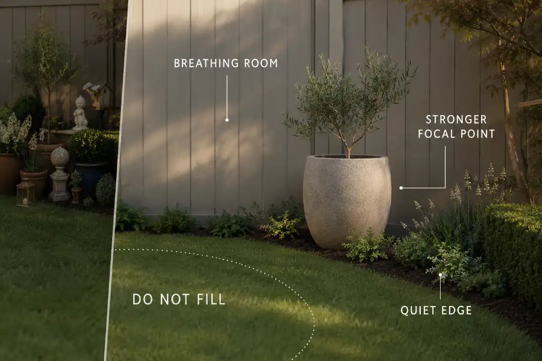
A large planter needs breathing room. A wall feature needs a quiet wall around it. A sculptural pot looks stronger when it is not surrounded by six smaller pots trying to help. Even a simple bench detail can lose its impact if every nearby surface gets filled.
In outdoor spaces, negative space can be open mulch, plain pavers, a clean tabletop, a simple stretch of fence, a quiet planting mass, or a gap between decorated zones. It does not have to be empty in a sterile way. It only has to be visually calm enough for the eye to rest.
This is different from physical clearance. A walkway can be open and still feel visually crowded if its edges are overloaded with little accents. A patio can have plenty of room to walk but still feel busy if every corner has a separate decorative statement.
The useful test is distance. Step back and look at the garden as one view, not as a collection of objects. If the focal piece disappears into a crowd, remove the items closest to it first. If the focal piece suddenly looks stronger, the problem was not the decor itself. It was the lack of visual space around it.
What most edits get wrong: The first item to remove is often not the ugliest object. It is the object creating a second focal point too close to the first one. A pretty piece can still be the wrong piece if it pulls the eye away from the main view.
Limit the Material and Color Palette
Material restraint can calm a garden even before you remove many objects.
Stone, ceramic, metal, wood, concrete, painted resin, glass, patterned fabric, and bright plastic all have different visual languages. A few can work together. Too many make the space feel patched together.
The cleaner filter is to choose two or three primary cues and let most decor stay within them. That does not mean everything must match. It means the garden should have a dominant language.
Weathered wood, aged metal, and muted terracotta can feel cohesive. Bright ceramic, glossy metal, resin animals, painted signs, patterned pillows, and glass stakes in the same view can feel restless.
Color works the same way. One repeated accent color can create rhythm. Too many accent colors create noise. If the plants already bring strong seasonal color, the decor may need to stay quieter. If the planting is mostly green and structural, one stronger decor color may be enough.
This section is not about which materials last longest outdoors. That is a different decision. Here, material restraint is about visual calm: fewer design languages competing in the same view.
Use Scale to Replace Quantity
If one small accent does not carry the view, adding five more usually makes the problem worse.
A small pot does not make much impact, so another pot gets added. Then a lantern. Then a sign. Then a statue. Then a second color. The garden slowly fills with supporting actors because no object is strong enough to lead.
One larger, calmer piece often does more than several smaller ones. A substantial planter at the right corner can hold the view better than five tiny pots along an edge. A simple water bowl can feel more intentional than several little ornaments.
A clean bench with one strong adjacent planter can do more than a bench surrounded by decor on every side.
Scale does not mean oversized. It means the object has enough visual weight for the space. In a small garden, that may be one medium-large piece with quiet surroundings.
In a larger yard, it may be a broader grouping or a stronger vertical object. The mistake is using many small accents because one small accent did not feel like enough.
If a piece needs several other pieces to make it noticeable, it may not be the right focal piece.
Know What to Remove First
Remove by visual role, not by guilt.
Do not start with the object you like least. Start with the object doing the least useful visual work. That may be a duplicate accent, a tiny item that can only be seen up close, or a piece that repeats a theme too literally.
Remove first
- Duplicate accents that repeat the same idea without adding structure.
- Tiny scattered pieces that make the eye count objects.
- Decor that creates a second focal point near the main one.
- Mismatched materials that do not connect to anything else.
- Filler pots that exist only because the space felt empty.
- Decorative signs, stakes, or ornaments that explain a theme too loudly.
- Pieces that look attractive alone but weaken the main view.
- Objects kept only because they were already purchased or already placed.
After each removal pass, stop. Do not immediately replace the empty spot. Let the garden sit visually for a moment. Sometimes the open space is the improvement.
The strongest edit usually leaves the garden with fewer pieces but clearer intention: one object leads, a few support, and the rest of the space gives the eye somewhere to rest.
When the Problem Is Not Visual Overcrowding
Some decor problems are not mainly visual; they are use problems.
If a planter narrows a route, a statue catches shoes, a pot blocks a chair from pulling out, or a decorative object interferes with a door, step, or delivery path, that is no longer mainly a hierarchy issue. That belongs in a more practical use problem, such as decor that blocks walkways and daily outdoor use.
The same boundary applies when the problem is weathering. If the decor is fading, rusting, cracking, tipping, or needing constant adjustment, the issue is not overcrowding first. It is outdoor performance.
If a piece looked perfect in a product photo but feels wrong in your yard, the problem may be scale, context, or expectation rather than simple clutter.
This page should not solve all of those. Its job is narrower: decide whether the decor is visually overcrowding the garden and edit the view before adding anything else.
The Cleanest Garden Decor Usually Has Fewer Jobs
Garden decor does not need to fill every gap to make a yard feel finished.
It needs to clarify the view. One piece can lead. A few pieces can support. Some surfaces can stay quiet. Some corners can remain undecorated. That restraint is not emptiness; it is the structure that lets the remaining decor feel more deliberate.
When a garden looks crowded, the best move is rarely to search for better accents. First, reduce the number of visual jobs.
Choose the focal role. Group the small pieces that truly belong together. Protect the negative space around strong objects. Limit the material palette. Remove repeated small decor that only adds noise.
The cleanest garden decor usually does less, but it does it with more authority.
For a neutral landscape-design reference on focal points and strong forms, see the University of Florida IFAS Extension guide to arranging plants in the landscape.