Minimalist front yard design is often misunderstood as doing less for the sake of simplicity. In reality, it demands clearer decisions, stronger priorities, and fewer mistakes. When minimalism works, it feels calm and confident; when it fails, it feels empty or unresolved.
Many front yards lose impact not because they lack features, but because they include too many competing ideas. Materials change too often, plants fight for attention, and pathways feel undecided. Minimalist design strips away that confusion so the structure can speak clearly.
The challenge is that minimalism leaves little room to hide errors. Proportion, spacing, and material choice matter more because every element is visible. This guide focuses on how minimalist front yards succeed—and where they quietly break down.
Establish a Clear Spatial Framework
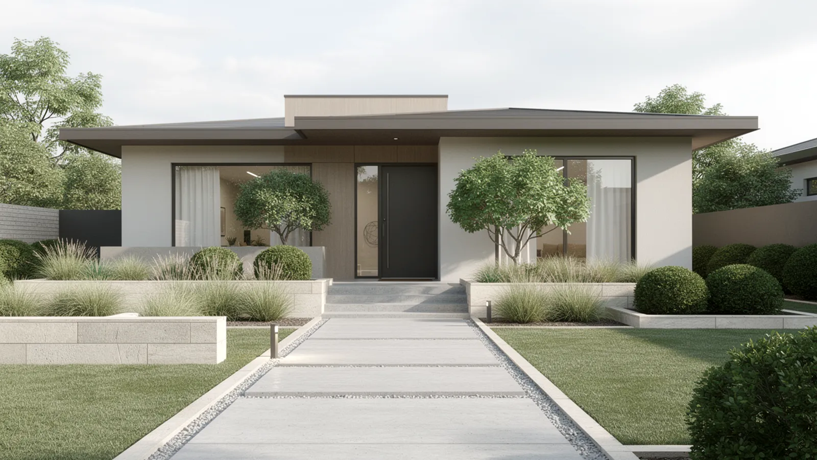
A minimalist front yard must be readable at a glance. You should be able to understand where to walk, where planting begins, and where space is intentionally left open without hesitation. That clarity is what creates visual calm.
✔️ Strong minimalist layouts usually share a few signals:
-
One obvious path leading to the front door
-
Planting zones that feel anchored, not scattered
-
Open areas that look intentional rather than unfinished
When the framework is weak, the yard feels uncertain. Paths drift instead of guiding, beds feel added on, and empty areas look accidental. Minimalism depends on commitment; half-defined spaces undermine the entire design.
Proportion ties the framework together. Walkways that are too narrow feel timid, while oversized paths overwhelm modest homes. Each dimension should relate to the house and lot size, not to inspiration photos taken out of context.
Reduce the Plant Palette with Discipline
Minimalist front yards rely on repetition to create order. A limited plant palette allows form and spacing to do the work instead of color and variety. This restraint keeps the landscape from feeling busy over time.
💡 Plant choices that support minimalism tend to:
-
Hold a clear shape throughout the year
-
Look intentional even without flowers
-
Grow predictably without constant correction
Too many plant types dilute visual strength. Even attractive plants lose impact when they compete with each other. Repeating the same species across multiple areas creates rhythm and makes the design feel deliberate.
Spacing is just as important as selection. Plants placed too close together quickly blur into mass, while thoughtful spacing preserves individual form. Minimalism benefits from allowing each element to breathe.
Let Negative Space Carry the Design
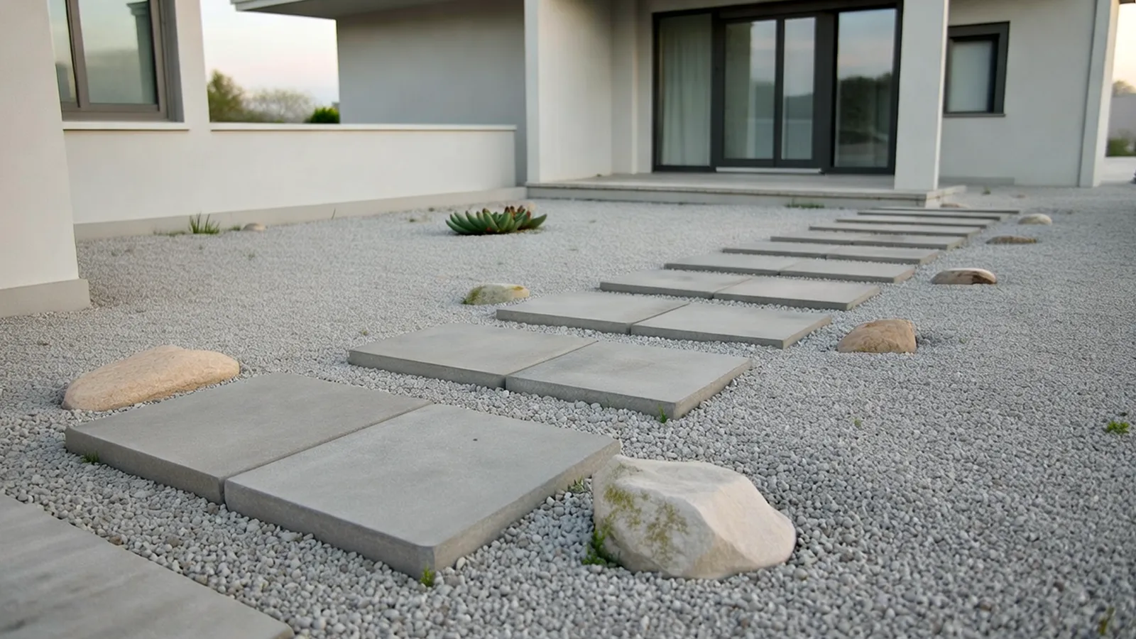
Negative space is not leftover space. In minimalist design, it is an active component that frames everything else. Gravel areas, open lawn panels, or uninterrupted paving give the eye somewhere to rest.
Clear negative space usually appears as:
-
Continuous ground cover without ornament
-
Open zones that separate planting from paths
-
Areas where nothing is added on purpose
⚠️ A common mistake is filling space to avoid discomfort. Extra plants, stones, or décor often weaken minimalism instead of improving it. When every area demands attention, the design loses hierarchy.
Negative space also improves function. Clear zones around paths and entrances support movement, visibility, and maintenance, reinforcing both form and practicality.
Select Materials That Reinforce Simplicity
In minimalist front yards, materials carry more weight because there are fewer of them. Each surface should feel intentional and consistent with the overall language of the home. Variety matters less than coherence.
Materials that work well in minimalist settings often:
-
Stay within a narrow color range
-
Repeat across multiple areas
-
Age evenly rather than dramatically
🐾 Texture becomes the main source of contrast. Smooth paving next to rough gravel or matte stone adds depth without visual noise. These subtle differences keep the space interesting without breaking simplicity.
Material choices should also support long-term clarity. Surfaces that stain easily, shift, or weather unevenly quickly undermine the clean lines minimalism depends on.
Design with Maintenance in Mind
Minimalism is only low maintenance when it is planned that way. Poor plant choices or inaccessible layouts create work rather than reducing it. A minimalist yard that is hard to maintain rarely stays minimal for long.
Maintenance-friendly designs often include:
-
Reduced or clearly defined lawn areas
-
Planting beds that are easy to reach
-
Hardscape with simple joints and edges
💡 Access matters more than many realize. If trimming, cleaning, or repairs feel inconvenient, neglect follows. Clear access protects both appearance and longevity.
Foundational principles for aligning simplicity with practical upkeep are explored further in How to Design a Low-Maintenance Front Yard.
Align the Yard with Everyday Use
A minimalist front yard must work as well as it looks. Daily movement—approaching the door, receiving guests, handling deliveries—should feel natural and unobstructed. Function reinforces calm.
Minimalist layouts support use when:
-
Walkways follow natural approach lines
-
Entry areas remain open and legible
-
Planting does not intrude into circulation
❌ Designs that prioritize appearance over use often fail quietly. Paths get worn in the wrong places, plants are trampled, and clutter accumulates to compensate for poor flow.
When everyday behavior is considered from the start, the front yard remains composed without constant adjustment. This functional clarity sets the stage for refining scale, rhythm, and restraint in the next section.
Refine Scale and Proportion Before Adding Anything Else
Minimalist front yards expose scale mistakes immediately. When there are fewer elements, anything slightly off feels amplified. Correct proportion is what separates intentional simplicity from a space that feels unfinished.
✔️ Scale problems usually show up as:
-
Walkways that feel either hesitant or oversized
-
Planting beds that look shallow against the facade
-
A complete lack of vertical reference, making the yard feel flat
Proportion should respond to the house first, not trends. A compact home needs tighter gestures, while wider facades can support broader paths and deeper beds. Borrowing proportions from unrelated examples is one of the fastest ways to break minimalist balance.
Viewing distance matters as well. Front yards are read from the street, the sidewalk, and inside the home. When scale works from all three perspectives, the design feels settled instead of awkward.
Use Repetition to Anchor the Design
Repetition gives minimalist landscapes their sense of order. It allows the eye to recognize patterns quickly, reducing visual effort. Without repetition, minimalism often feels random rather than refined.
Effective repetition often appears through:
-
One primary hardscape material used consistently
-
A single plant species repeated across multiple zones
-
Even spacing between lights, plants, or joints
💡 Variation should always stay secondary. Small shifts in spacing or grouping can add life, but the dominant pattern must remain obvious. When variation becomes the focus, rhythm collapses.
Repetition also supports long-term clarity. As materials age and plants grow, repeated elements tend to change together, preserving cohesion instead of creating imbalance.
Integrate Lighting Without Visual Disruption
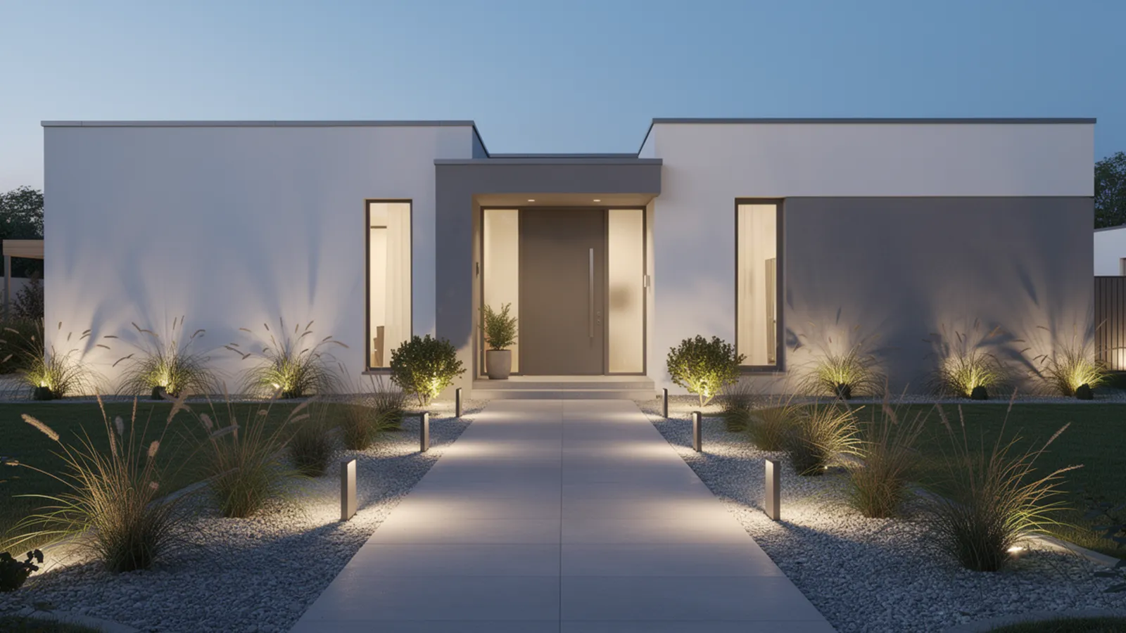
Lighting should reveal the landscape, not decorate it. In minimalist front yards, fixtures work best when they are barely noticeable during the day and quietly effective at night. Placement matters more than quantity.
Minimalist lighting works when it:
-
Clarifies circulation after dark
-
Highlights one or two vertical elements
-
Uses a consistent light temperature
🐾 Overlighting is a common failure point. Too many fixtures flatten shadows and remove depth, making the space feel harsh instead of calm. Minimalism relies on contrast created by restraint.
Consistency is critical. Mixing fixture styles or color temperatures breaks visual unity quickly. A simple, unified lighting strategy keeps the yard legible and composed after sunset.
Lighting approaches that balance restraint with visibility are explored further in Front Yard Lighting Ideas That Enhance Curb Appeal.
Simplify Color to Protect Form
Minimalist front yards depend on controlled color more than most styles. Fewer colors allow shape, spacing, and material quality to take priority. This restraint keeps attention where it belongs.
Color simplicity is strongest when:
-
Hardscape stays within a narrow neutral range
-
Planting relies on one dominant green family
-
Contrast appears sparingly and deliberately
⚠️ Too much contrast fragments the design. Even small accent colors can disrupt calm if they appear too often. In minimalism, emphasis comes from placement, not brightness.
Seasonal change should be subtle. Texture shifts and slight tone variation maintain interest without pulling focus away from structure.
Clarify Transitions Between Zones
Even minimalist front yards contain multiple zones, such as paths, planting areas, and buffer spaces. How these zones meet determines whether the yard feels organized or uncertain.
Clear transitions usually rely on:
-
Sharp material edges
-
Consistent elevation changes
-
Obvious separation between movement and planting
💡 Transitions do not need to be dramatic. Low edges, shallow steps, or slight grade changes define space without adding bulk. These details reinforce order quietly.
Unclear boundaries invite shortcuts and wear patterns. When people invent their own paths, visual discipline breaks down. Clear transitions protect both form and function.
Resist Decorative Additions
Minimalist front yards gain strength from what is left out. Decorative objects often compete with structure and dilute clarity. In restrained designs, subtraction is usually more effective than addition.
Decor tends to weaken minimalism when it:
-
Introduces new colors or materials
-
Interrupts established rhythm
-
Draws attention away from circulation
❌ Trend-driven or sentimental items age quickly in minimalist spaces. While meaningful, they often conflict with the disciplined language of the design.
When decoration is used, it should feel architectural rather than ornamental. One integrated element can work if it aligns with scale, geometry, and material choices. Discipline remains the defining rule.
These decisions prepare the yard for its final test: how it performs over time, adapts to growth, and supports daily life without losing clarity, which comes next.